

Contrast and Curves in Photopea
- Nicole Pollard
- Aug 28, 2024
- 1 min read

Updated: Sep 14, 2025
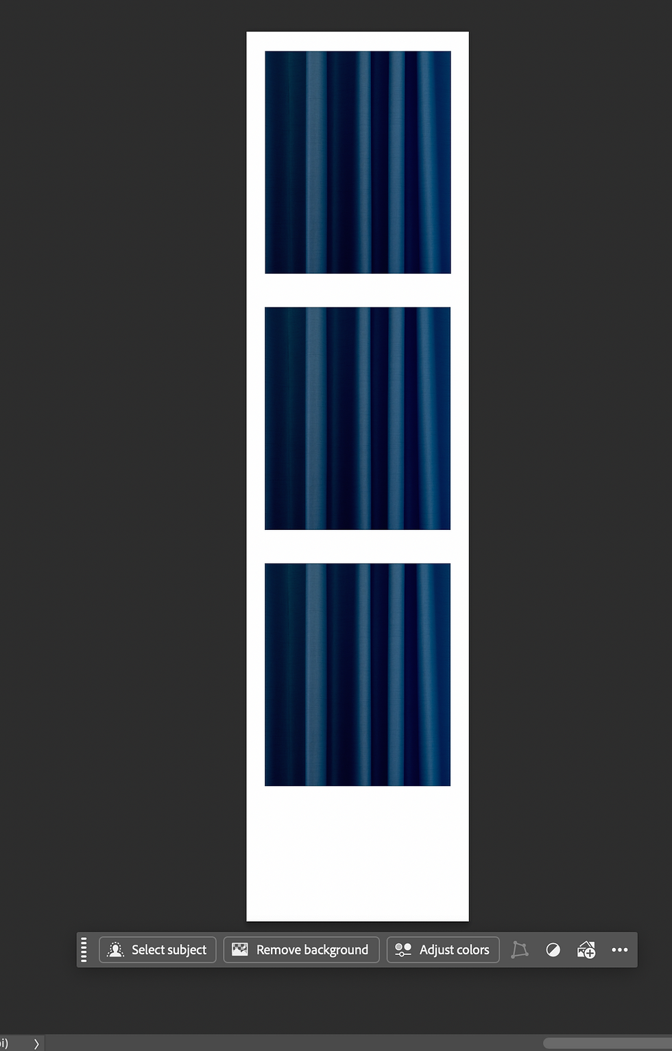
Review of Contrast- Recreating the iPod advertisement
Today we'll be recreating this popular ipod ad that demonstrates contrast.
Contrast in graphic design is the difference between visual elements in a composition that are placed close together and are noticeable. It can be used to create visual interest, hierarchy, and emphasis. Color contrast is important in digital design because it enhances readability, ensures accessibility for users with visual impairments, and creates a visually appealing and engaging experience
We will be using the curves tool in Photoshop is a powerful adjustment tool that lets users manipulate an image's tonal range, contrast, and color balance. It's considered one of the most versatile and essential tools for photo editing.
In Photoshop's Curves graph, the x-axis is the original brightness of your image, and the y-axis is the new brightness you set.
Think of it as a simple "before and after" map:
X-axis (Input): The original brightness values of your image's pixels. It runs from the darkest tones (shadows) on the far left to the brightest tones (highlights) on the far right.
Y-axis (Output): The new, adjusted brightness for those same pixels. It runs from dark at the bottom to bright at the top.
Once we are done editing the example, you will take a photo of each other to create a similiar ad.


Comments